COMPOSITIONS
MACINTOSH CONTROL PANEL
This composition is the original Macintosh Control Panel UI layout from 1982. The panel depicts an influential example of a gridlike layout, as well as the use of universal symbols and animations rather than text explanations or buttons. The goal of this was to create a universally understood control panel that users can look at and not feel intimidated by the amount of options.
The main typeface being used in this composition is Chicago, which was created by Kare herself in order to have a font that is usable and readable even within such small technical boundaries. The font is most noticeable in the title, which reads “Control Panel”. This, being a primary piece of information, is the biggest and boldest use of the font, showing users immediately that they are currently on the control panel. The second piece that the users eyes drift to is the date and time, both due to the size of the fonts, as well as the gridlike layout that users tend to read from left to right.
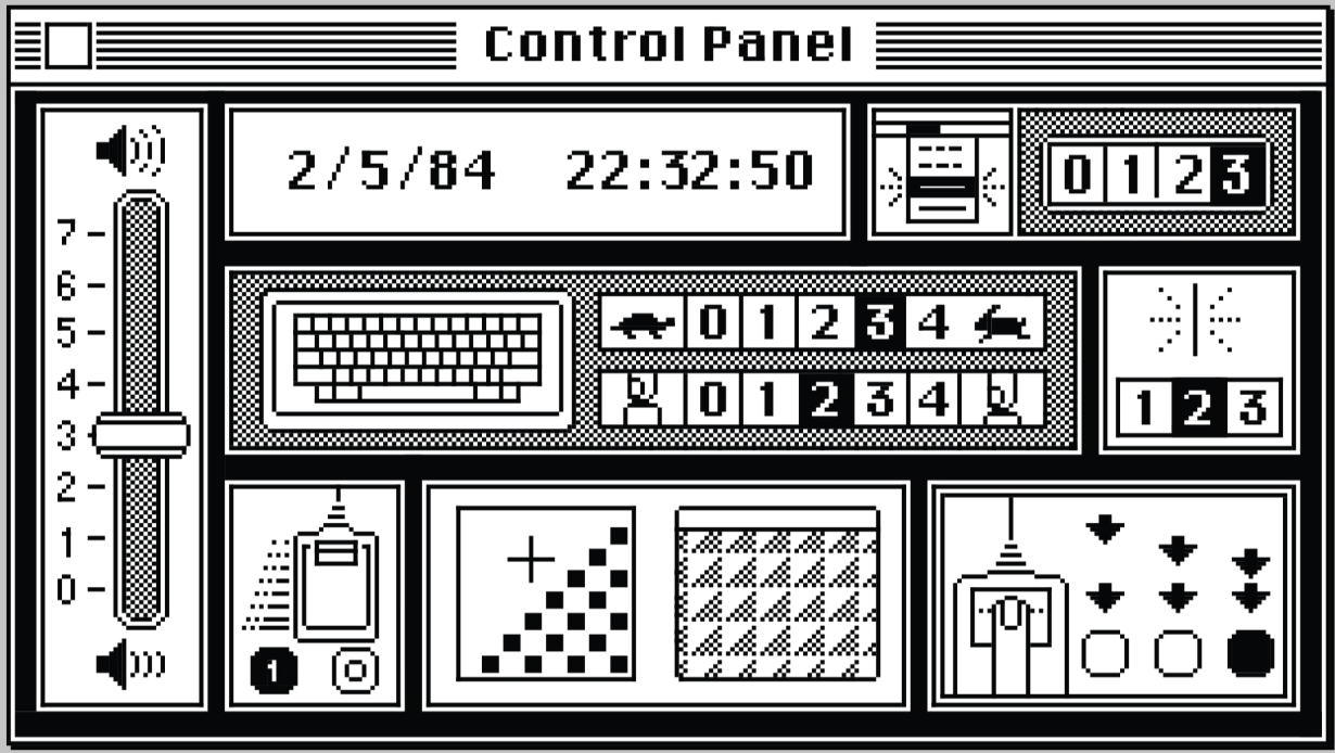
Simple icons and drawings are used to represent buttons, to further enhance overall comprehensibility and curate a universal understanding of the settings. For example, to the right of the keyboard icon, there is a turtle and rabbit with numbers in between ranging from 0 to 4. The user will very likely be able to immediately interpret these turtle and rabbit icons as “slow” and “fast”, and the numbers in between determining how fast/slow the setting will be.
Putting it all together by placing it in the same grid as the keyboard helps show the significance of the fast/slow setting, implying that it relates to the speed of repeating keys. The grouping of each section is clear, with a thick black line being in between each part of the grid. This is an impressive display of how Kare put attention into how certain buttons would be represented and grouped, in order to maintain a clear and concise appearance.